
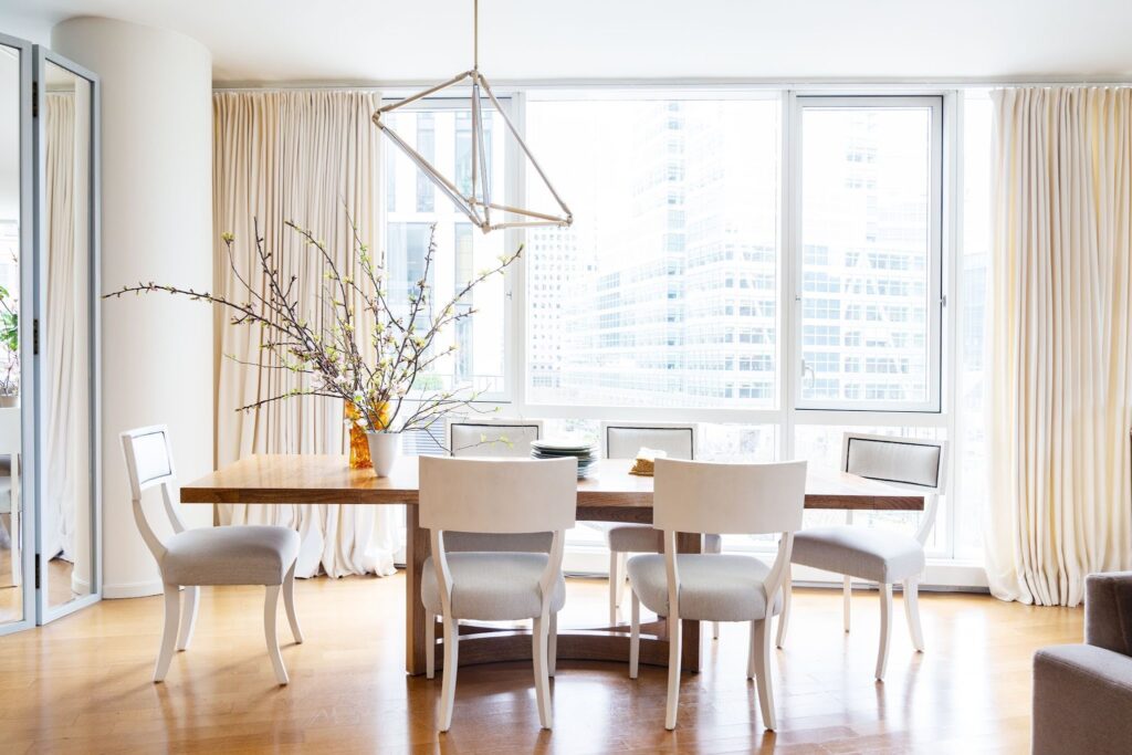
I live in Tribeca, and my studio is here too. Most mornings I walk past cast-iron facades and cobblestone that haven’t fundamentally changed since the 19th century, then come home to an apartment that has to work hard for a family of three in 2026. That tension between the fixed and the livable is the design brief of the whole neighborhood.
If you’re decorating a Tribeca apartment, or any Manhattan loft with real architectural character, you’re starting with something most designers would kill for. The catch is that it asks for a different approach than a standard apartment renovation. Much of what follows applies whether you’re working with a sprawling loft or a small pre-war one-bedroom: scale, zoning, art, and committed pattern matter in a 700-square-foot apartment as much as a 3,000-square-foot one. Here’s what I’ve learned designing in this neighborhood, and living in it.
Start with what’s already there
Tribeca’s architecture comes from a specific history. Warehouses, sugar refineries, and cast-iron merchant buildings were converted to residential use beginning in the 1970s, when artists colonized what was then an abandoned manufacturing district. What that history left behind, the heavy timber columns and soaring ceilings and exposed brick, is irreplaceable. You can’t fake it, and you can’t buy it new.
The biggest mistake I see clients make is treating those elements as obstacles. The column in the middle of the living room, the original tin ceiling that’s been painted over seventeen times: these aren’t problems to solve. They’re the project. Before we talk paint colors or furniture plans, I want to understand what the building is actually handing us.
In a landmarked Tribeca building, you often can’t make significant structural changes anyway. Between the Landmarks Preservation Commission and the co-op board, plenty is off the table. But in fifteen years of designing in this city, I’ve found those limits almost always improve the work. When you can’t knock it all down and start over, you’re forced to design with what’s there, and what’s there is usually extraordinary. It’s the same lesson I keep relearning: the most sophisticated spaces tend to emerge when you embrace what exists rather than starting from a blank slate.

Think in zones, not rooms
Open-plan living is the defining spatial challenge of a Tribeca loft, and it asks for a different logic than room-by-room decorating.
In a conventional apartment, walls do the organizing for you. In a loft, you create that structure yourself with furniture, rugs, lighting, and millwork. I think of it as composing a sequence of rooms without partitions. Each zone needs its own purpose, its own scale, its own focal point. The living area, the dining area, the reading nook should each feel intentional and distinct, even as they flow into one another.
A few principles I come back to constantly. Rugs define zones more powerfully than walls; a well-chosen one anchors a seating or dining area and draws a boundary without interrupting light or sightlines. Floating your furniture matters more than people expect, because pieces shoved against the walls leave a directionless void in the center of the room, while a sofa turned to face into the space immediately claims territory. And lighting is how you mark the transitions: a pendant over the dining table, a floor lamp anchoring the reading corner, warm sconces flanking the kitchen, each one signaling that a zone has ended and another begun without saying a word.
Sometimes a zone needs a firmer boundary than furniture alone can draw. On one project, I had to carve an office out of an open-plan living area, so I commissioned a custom mirrored, floor-to-ceiling folding screen to delineate the space, then lined the adjacent wall with semi-custom bookshelves to give the new zone its “office” identity. The screen does the spatial work while the shelving signals the room’s new purpose. It’s proof that even in an open plan that resists walls, you can define a room without building one.
Raw or refined: pick a direction
The Tribeca aesthetic isn’t one thing. On one end is raw industrial, with exposed ductwork, concrete floors, blackened steel, the loft as found. On the other is refined modernism, where the industrial structure is honored but everything else has resolved into something quieter and more considered.
Most of my clients land somewhere in between, and figuring out exactly where is one of the first things we work through together. A client who loves the patina of the original building may want us to lean into the exposed brick, add custom steel windows, keep the palette earthy and material-forward. Another client in the same building might want that industrial architecture to recede, with white walls, plaster details, and luxurious textiles, so the space reads more like a refined townhouse than a converted warehouse.
Neither is wrong. What’s wrong is not making the choice, and ending up with a space that’s neither committed to its industrial heritage nor successfully carried beyond it. This is the juncture I’m always working at, where explosive maximalist English style meets the strength and calm of architectural form. The mash-up only works when you’ve decided which note leads.
Scale everything up (including the art)
If one technical instinct separates an experienced loft designer from everyone else, it’s scale.
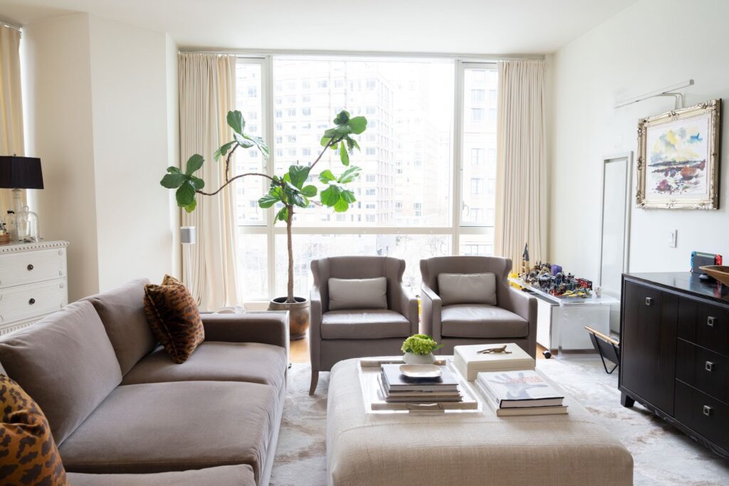
Furniture that looks generous in a showroom can vanish under a 12-foot ceiling. A rug that would anchor a standard living room becomes a bath mat in a 2,500-square-foot open plan. And art has to be rethought entirely. Oversized work often feels more intentional in a high-ceilinged loft than a scatter of smaller pieces; a single canvas that would overwhelm a regular apartment becomes exactly proportionate when the ceiling is eleven feet. In rooms with that kind of vertical scale, hanging large pieces or gallery groupings higher than standard eye level emphasizes the architecture rather than fighting it.
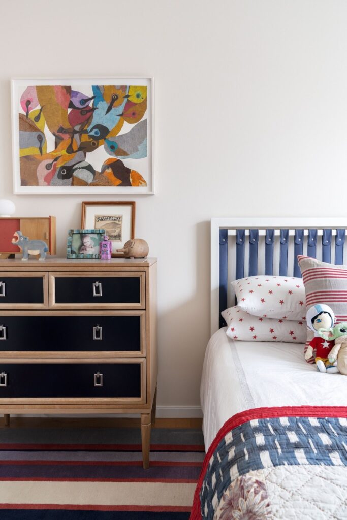
Here’s where I happily diverge from conventional wisdom, though: scale isn’t always about going bigger. Some of the most powerful art moments I’ve created in Tribeca involve a deliberately small piece, surrounded by generous negative space, asking you to step closer and look. Art personalizes everything; it’s where I begin, not where I finish. In my own apartment, I’ve paired large abstract paintings with a small piece made entirely of colored artist’s tape. Their color stories don’t match in any traditional sense, but every piece shares an ineffable quality, each just different enough to create harmony rather than predictable coordination. That tension is what I’m always chasing.
The rule I keep returning to is that artwork above furniture should span roughly two-thirds to three-quarters the width of the piece below it. But in a loft, that math has to account for the ceiling too. A 90-inch sofa against an 11-foot wall is a different problem than the same sofa in an 8-foot room.
Art is the foundation
Tribeca has a gallery culture most Manhattan neighborhoods don’t. The neighborhood’s rise as a residential destination is tied directly to its art history: artists came first, galleries followed, and the residents who arrived after absorbed that sensibility. Many of my clients here walk in with collections already underway.
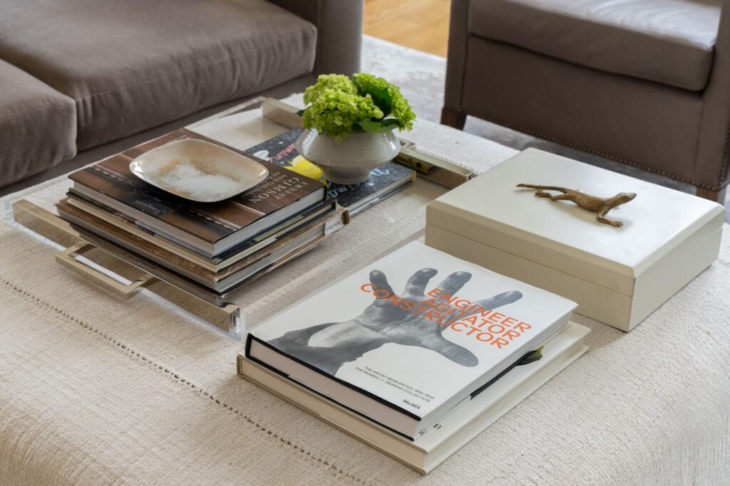
So I treat art as the starting point of a design. Before we talk paint or upholstery, I want to know what’s on the walls, what’s in storage, and what a client loves and can’t quite explain why. The furniture, the textiles, the millwork should all be in conversation with the art.
In practice, that often means keeping backgrounds and furniture more restrained so the collection can do the work. It can also mean designing architectural moments for specific pieces: a reading nook built around a single small portrait at eye level, a long hallway hung salon-style with a collection grown over years, a built-in shelf that frames a ceramic as deliberately as a gallery vitrine.
Custom millwork: spend the money
In a loft, built-ins earn their cost in a way they simply don’t in a conventional apartment.
In a standard apartment, walls provide structure, storage, and visual organization. In a loft, you build that infrastructure from scratch. Custom millwork does several things at once: it organizes the large wall surfaces a loft produces, supplies the storage that open plans lack, and gives a raw space a sense of permanence and intention.
This matters most in landmarked buildings, where structural changes are limited and you can’t always move a wall or add a room. What you can do is build a floor-to-ceiling system that defines a library zone, wraps a column, and hides mechanical access, all while looking like it was always meant to be there.
Millwork also does what furniture can’t: it fits the building’s quirks. Uneven walls, exposed columns, and sloped ceilings make off-the-shelf cabinetry look apologetic. Custom work follows the actual geometry, so nothing reads like it’s sorry to be in the room.
Pre-war bones: preserve, don’t smooth over
Some of the best New York homes I’ve worked in are pre-war: smaller, more compartmented, and full of details that are expensive to replicate and impossible to truly recreate. Original parquet floors, pocket doors, plaster moldings, the odd butler’s pantry. These are the things that give a small apartment its soul, and they’re the first casualties of a careless renovation.
My instinct is always to preserve those features and contrast them with something contemporary, rather than smooth everything into a generic gut job. A pre-war apartment that’s been stripped of its moldings and flattened into open-plan blandness has lost the one thing it couldn’t buy back. The more interesting move is to let the old and the new speak to each other: a modern light fixture against a hundred-year-old ceiling medallion, a contemporary painting over original wainscoting. That contrast is where the tension I love lives.
Where a feature is too far gone to save, I’d rather replace it honestly than fake it. A clean, well-detailed contemporary intervention reads as intentional; a poorly cast reproduction molding reads as a costume. The same principle that governs everything else applies here too, which is honesty over imitation.
A few things that always come up
After many years designing across Manhattan, in lofts and small pre-war apartments alike, a few consistent truths about New York home design.
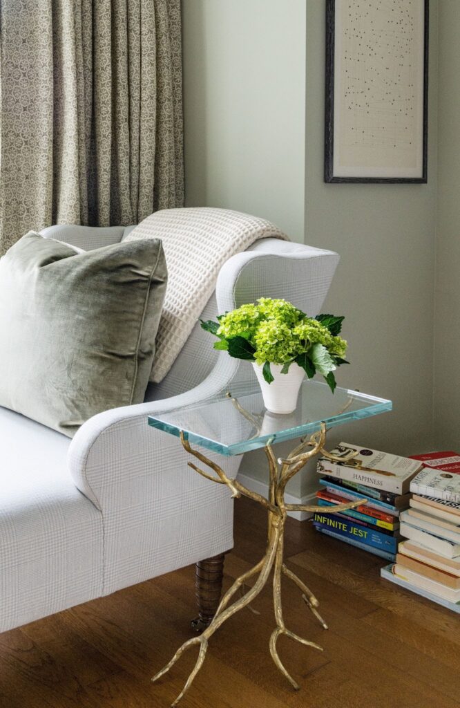
Pattern works harder in small spaces than people expect. A bold wallpaper in a narrow entry or a small powder room doesn’t overwhelm; it resolves. The discomfort comes from tentative choices, never committed ones. And the boldest move isn’t always on the walls. In one Battery Park City apartment entry, a shimmering metallic treatment covers a recessed ceiling, lit from a cove around its edge. The walls are quiet grasscloth; the ceiling is where the room gets a little more daring.
Every rental deserves the same rigor as a purchase. Long-term renters in Tribeca often hold back because they don’t own the place, and that’s a mistake. Custom draperies, quality rugs, and real lighting don’t require touching the walls, and all of them transform a home you’ll live in for years.
The trade matters more than people realize. The right workrooms, fabricators, and showrooms are half of what makes a New York project come together, and the good ones are local knowledge, not a Google search. A workshop like Naula, which has built custom pieces for me for years, is exactly that kind of resource: passed between designers, not necessarily found online.
Working in Tribeca
A full design project in Tribeca, or anywhere in Manhattan, needs someone who understands both the design and the constraints: the co-op approval process, the LPC if you’re landmarked, the DOB filings, the building-specific alteration agreements that govern what you can and can’t touch.
At Laura Krey Design, we work with clients across Tribeca, the West Village, the Upper West Side, and beyond, handling all of it so the design stays the priority.
→ View our portfolio | Start a project conversation | Learn about our process

Leave A Comment