
Neutrals have earned an unfortunate reputation for creating bland, safe spaces. But here’s what most people miss: many of my favorite “neutrals” are actually colors with the volume turned down—tones with less intensity and saturation that function like neutrals, while still holding onto personality. These are what I think of as the new neutrals: calm, sophisticated, and quietly distinctive.
Pantone’s Color of the Year 2026, PANTONE 11-4201 Cloud Dancer, reflects this same shift. It’s a soft, lofty white that leans into peace, lightness, and fresh starts. I’ve been advocating for this kind of foundation for years: subtle, desaturated tones that create space for pattern, texture, and layering without visual chaos. The result feels restrained, but richly collected.
What Makes a “New Neutral”?
Traditional neutrals — beige, tan, standard gray — often read as “safe” rather than considered. New neutrals are desaturated versions of actual colors that retain just enough “color memory” to feel intentional:
- Dusty sage instead of flat gray
- Muted terracotta instead of standard beige
- Soft slate blue instead of greige
- Ochre-touched whites instead of stark white
In our Manasquan home office, I specified Benjamin Moore Sand Pebble, a warm, desaturated tone that reads neutral from a distance but reveals complexity up close. That quality of “revealing itself over time” is what separates thoughtful color from a decorative default.
Why Desaturation Works (and Why It Feels Calm)
As an art historian, I spent years studying how artists manipulate color. Saturation affects emotional response as much as hue does. Highly saturated colors demand attention and can create tension; desaturated versions of those same colors allow your eye to rest.
When you reduce saturation, while keeping an eye on undertone and temperature, you get environments that feel serene without feeling sterile: cool grays with barely-there blue, warm whites like Cloud Dancer, greens so soft they nearly disappear.
The New Neutrals Checklist
If you want this approach to work (and not fall flat), start here:
- Pick a temperature first: warm, cool, or balanced.
- Choose “color memory,” not colorlessness: a whisper of hue is the point.
- Test in three lights: morning, afternoon, and evening lamp light.
- Match saturation levels, not exact hues: cohesion comes from shared intensity.
- Plan your texture strategy: calm color + layered texture = the magic.
Five Mini Palettes You Can Steal
These are “mix-and-match” starting points—use them as a framework and adjust for your home’s light.
1) Warm Quiet (Soft, welcoming, never beige)
- Walls: warm off-white / ochre-touched white (Cloud Dancer direction)
- Accent: muted terracotta or clay
- Metals: aged brass
- Wood: white oak or warm walnut
- Textiles: linen, boucle, natural woven shades
2) Cool Calm (Clean, architectural, still cozy)
- Walls: soft slate blue-gray
- Accent: smoky blue or blue-green
- Metals: nickel or blackened steel
- Wood: ash or pale oak
- Textiles: wool, textured cotton, tonal stripes
3) Green Whisper (Serene, grounded, quietly English)
- Walls: dusty sage or softened olive
- Accent: stone, putty, or warm white
- Metals: unlacquered brass or antique bronze
- Wood: walnut or stained oak
- Textiles: block prints, small-scale florals, grasscloth
4) Collected Neutral (Best for pattern lovers)
- Walls: Sand Pebble–type warm desaturated neutral
- Accent: muted terracotta + dusty blue (same saturation level)
- Metals: mixed—but keep them aged/soft, not shiny
- Wood: medium oak
- Textiles: layered patterns in low-contrast tones
5) Soft Monochrome (Minimal, but not flat)
- Walls: gentle gray with a faint undertone (blue or green)
- Trim/Ceiling: warm white (to avoid feeling icy)
- Metals: matte black + a touch of brass
- Stone: honed marble/limestone look
- Textiles: plaster-like textures, ribbed linen, subtle weaves
How to Combine Colors Without Getting “Busy”
A quick rule that works surprisingly well: keep saturation consistent across the room. A dusty blue and muted terracotta can coexist beautifully if they share the same “volume level.” This is how you get variety without chaos and cohesion without monotony.
And don’t skip lighting tests. Desaturated colors shift throughout the day; those subtle changes are part of their appeal.
Texture: The Secret to Neutral Rooms With Depth
Once the palette is quiet, texture becomes your most powerful tool.
Vary surface quality. In our Manasquan office, I paired Sand Pebble paint with grasscloth wallpaper in the same tone—color stays consistent, but texture creates dimension. One surface absorbs light; the other reflects it softly.
Mix materials thoughtfully. In our pool house, whitewashed pine walls bring rustic texture against the subtle shine of metallic wallpaper on the ceiling. Plaster sconces add sculptural form. Every surface contributes interest, while the overall room stays calm because the palette is restrained.
This is also where I love the contradiction: a juncture between maximalist English influence and architectural calm. You don’t need loud color when pattern, scale, and texture are doing the work.
Beyond Paint: Extend the Philosophy to Materials
New neutrals aren’t just wall colors, they’re a filter for every finish decision: flooring, stone, wood tone, metal.
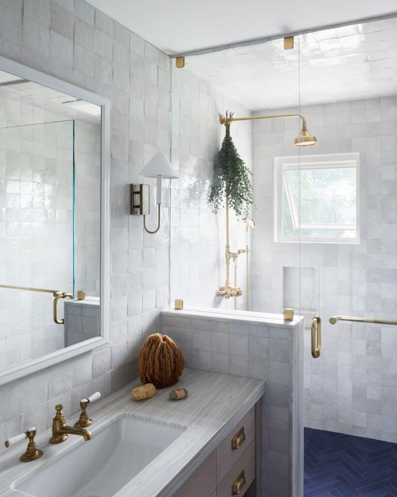
In our junior suite bathroom, zellige brings handcrafted texture in barely-there tones that feel elegant rather than try-hard. And a terrazzo dining table I commissioned is a perfect example: terrazzo contains multiple colors, but when those colors share similar saturation levels, the overall effect reads as sophisticated neutral despite the complexity.
Common Mistakes (That Make Neutrals Feel Boring)
- Mixing saturation levels: one bright note can make everything else look muddy.
- Ignoring undertone: a “neutral” can turn pink, green, or icy in the wrong light.
- Going too flat too fast: calm doesn’t mean lifeless—add texture early.
- Choosing trend over environment: the best neutral is the one that works in your home’s light.
Why New Neutrals Last
Highly saturated color trends come and go. Desaturated tones tend to age gracefully because they’re more flexible, foundational without being rigid. When your base is timeless, you’re free to evolve through art, textiles, and accessories without your walls fighting back.
The most successful new neutral spaces don’t announce themselves immediately. They reveal layers over time. Restful, engaging, and lived-in in the best way.
Ready to Build a New Neutral Palette That Feels Like You?
If you want a calm, sophisticated foundation that still has personality, and a plan for texture, pattern, and materials that keeps it from ever feeling boring, contact Laura Krey Design. We’ll develop a palette tailored to your home’s light, your lifestyle, and your version of “collected.”

Leave A Comment